Showing posts with label interior decorating. Show all posts

Thursday, 24 May 2012

How to create your own Gallery of Wall Art

A few weeks ago at the Ultimate Women's Show many people complimented me on the job I had done on the 'photo gallery' in my basement.   (Thank You!) A number of people I spoke to wanted to do something similar but were unsure about how to go about doing so.

So pretty with the soft blue-green back drop

I found that there really is no hard and fast rules to follow, rather, it is more of a personal preference to how you wish to place your collection.  However,there are some guidelines to loosely follow that will help you bring it all together and get just the right look that you are after.


This room is soooo romantic
The rule that guided me was to have a common theme that united the gallery.  Examples of how this can be done are by using the same colour or style of frames; black and white photography; or having the same print but in different colours or finishes. 

Andy Warhol is famous for art such as this where a photo is repeated in different colours

Measure your proposed arrangement first either on the wall with paper cut outs the same size of the frames or on the floor as I did in the picture below.  This will give you an idea of how your masterpiece will look once hung & save your wall from having too many nail holes due to mistakes.

Sorry for the angle, but you get the idea

For my own gallery I wanted a mix of old and new frames to incorporate older accessories that would help complement my upcycled large antique buffet.  Although the theme of our pictures shared a common thread in being photographs taken during our travels, I still wished for something more to tie them all together and provide a cohesive look.

Matt colour - CC512 - Marshlands - Benjamin Moore
To keep costs down I decided to simply use the large printed colour samples from Benjamin Moore as mats instead of having photographs framed and matted professionally.  It took a bit longer to measure it all out myself but I was pleased with the end result for the budget I had to work with. 

I purposely chose not to centre the main photo of 'Ayres Rock' in line with the buffet and made sure I had enough room to include accessories such as my lamp & Chris's Bali dolphins on the left side.

Source


Some galleries of wall art are uniformed as above and some are scattered with no formal lines or boundaries.  It all depends on how your home is styled and what you like best.

Here are some more examples to help you decide which style will work best for you.

No 'Negative' space happening here! Quite busy and eclectic, but that may just be the way you like it.

Contemporary, clean and casual.

Why not try something completely different?  Plates are making a return in home decor accessories.

I really like this.
Need help deciding on where and how to put together your gallery of photographs, art or accessories?  Please contact me and I will be happy to offer my professional opinion to get you started.  claire@creatingcontrastdesigns.com

Tuesday, 15 May 2012

Passionate about Patterns - Part 1

Whether you are looking at wallpapers, fabrics, wall tiles or flooring, there are an abundant amount of patterns to choose from.  But what do patterns say about you and which styles are best for each application? 


Let's start by looking at some of the more traditional patterns used in the past that are making a comeback in today's modern world.

Paisley - a twisted teardrop or a droplet-shaped vegetable motif of Persian and Indian origin (wikipedia).  The paisley pattern for me was always associated with my grandfathers' suit ties, but this funky little shape is working it's way into home decor once more.

Above -  the white and green paisley fabric on a pastel blue backdrop gives this headboard a fresh, clean and updated look. 

Damask is typically known as a more traditional and elegant pattern often used in wallpaper and for fabrics.  The motif design is generally raised against the background which is usually a different colour.  This isn't always the case, but as with any design it helps make the pattern pop more when the colour scheme is not a monochromatic one.

Because Damask is quite a busy pattern, it tends to work best on larger applications like bedding and drapery.  Wallpaper is also a great place to use damask patterns.  I always remember when I was younger one of my mom's friends had a raised velvety black damask pattern on top of a gold background. How I loved to touch that wallpaper!


Modernised Damask with pops of colour for today's trends.
Scroll Designs are great if you are looking to add some movement to a space.  This type of pattern is ideal for adding softness to cold and hard surfaces.  The picture below is a perfect example of this.

Source

Geometric shapes are popular in today's contemporary design.  There are so many varieties and colours that there is no excuse for boring or uninspiring spaces anymore!  Here are some pictures of pattern styles seen in current home decor trends.

Moroccan

Black and White Moroccan styled pattern on a contemporary ottoman

Greek Key

My current favourite colour combination is featured here- Orange & Purple, very fun!
The area rug pictured above has a Greek Key pattern and the mirror on the wall behind the couch is Moroccan inspired.   I like how the decorator has repeated the same same purple and white hues for consistency but mixed up the pattern styles on the chairs and throw cushions.

Garden Gate


Classic contemporary setting - the side lamp repeats lines found in the 'Garden Gate' pattern.

When using patterned fabric for upholstering, be sure that the scale of the pattern is appropriate for the size of the furnishing.  A large scaled pattern will not work on a small stool for example. 

Also, if you are taking a piece to be re-upholsterered by a professional, they should know how best to place the patterned fabric on the piece of furniture so it complements it in the best possible way.  Discuss this with them first though to be sure.

Mixing patterns look fabulous when done right


There is such an array of patterns that I decided to have this be a Part 1 in my series of my 'Pattern Talk.'  Otherwise, this post would be never ending! 

Puzzled by all the possibilities of patterns?  Contact me and I will help you choose the best patterns in the best colours and for the best applications.  e-mail me:  claire@creatingcontrastdesigns.com

Don't forget if you aren't already signed up to ~delicious decor~ become a subscriber before the end of May and receive my 'DECOR TIPS TO HELP YOU CREATE A BEAUTIFULLY DESIGNED SPACE'.  Scroll up and enter your e-mail address at the top right side of my blog. 


Thursday, 10 May 2012

Creating Contrast, it's more than just my business

Contrast in the dictionary is explained as 'a distinction or emphasis of difference by comparison of opposite or dissimilar things'.  The most popular and often thought of way to create contrast is by using strong colour contrasts such as 'black and white'.  

To me, this image stirs up emotion that is both calming and complex at the same time

The lighting in this photo (above) really emphasises the contrast between the light skin and dark tattoos.  Now let's take a look at black and white contrast within Interior  Design.

Black painted doors give strong form to this space
Creating elements of contrast within a design adds visual stimulation as well as 'interest' to a space.  Rather than the usual black and white, there are many colours and tones that can be used to create contrast that mustn't be overlooked.  Accent walls are a popular way of doing this but don't limit your imagination to just painted walls.

Your eye is immediately drawn to the sexy lipstick red coloured cooker.
By injecting an unexpected element such as the bright red coloured stove above, there is a suggestion of playfulness in this rustic farm kitchen.  Notice how the red is also repeated a few times throughout the room : - the numbers on the clock; the wall tiles and various accessories.  This helps give flow to the space and support the otherwise 'out of the norm' colourful appliance.

Another way to create juxtaposition is by mixing Interior Design styles.

Source
In the above picture, a traditional tufted and skirted camel back sofa has been paired successfully with more modern elements such as - the contemporary patterns on the throw cushions; a wild zebra area rug and small ghost tables.  This type of contrast within designs work well when the pieces have been balanced and styles have been repeated.

More contrast between design styles are displayed in the picture above.

Re-upholstering antique furniture in bold, modern fabrics is quite the trend these days in upcycling.  

Pyschidelic bergere chair in a black and white chevron pattern


Designer Geoffrey Bradfield designed these chairs in honour of the late Alexander McQueen.
In the photo above the classic fauteuil chair has 2 different patterns that are no reflection of the actual period piece itself, but no one could argue that they would definitely make quite the conversation piece!

What about Creating Contrast by using various shapes?  This room below is a great example of how different shapes, forms and lines can all be used to create contrast.  Again, opposing textures such as the shiny satin bedding, crushed velvety head board and sparkly crystals are all contributing to this mix of contrasting elements.

In my opinion the lamps don't seem right in this space 

Next time you are decorating a space, why not get creative and use contrast in more ways than one?

Also, this MAY just be the month for you!  For all subscribers of ~delicious decor~ I will be sending out my 'DECOR TIPS FOR CREATING A BEAUTIFULLY DESIGNED SPACE'.  If you are not yet subscribed to ~delicious decor~ but would like these fantastic tips list, please sign up to my blog before May 31st and I will be sure to send you this exclusive offer you don't want to miss!

If you want help in Creating Contrast Designs, then please contact me and I can help you fall in love with your home again!  e-mail: claire@creatingcontrastdesigns.com

Monday, 7 May 2012

The Ultimate Womens Show was the place to be!

What a weekend.  The Ultimate Women's Show in Hamilton was the first show that I have participated in as an Exhibitor and boy was it fun!  Hard work and tiring, but fun.
 
My booth was just a 5' x 10' space, so I had to work my design magic to ensure it got noticed without being too crowded. My show piece was my antique buffet which was very functional as not only was it great for displaying accessories, but the extra storage also came in handy.

Some of my pictures turned out blurry, sorry about that.  But you get the idea.
Many people commented on how much they loved the updated antique piece and especially the colour and new hardware.  'Violet' is what I named my mannequin, she was dressed in fabrics from Avant Garde, Maxwell and Joanne Fabrics. 

My florals were done by my good friend and fellow Interior Decorator Maria who did a fabulous job of incorporating all the colours in my display.  Thanks for all your help over the weekend Maria, you are the best!

I decided to use purples, greens and yellows and 'pop' with the colour of the year, Tangerine Tango.

I was right in the middle of the action having a corner booth by the main stage.  The fashion show was fantastic, showcasing clothing and accessories from local shops. Here are some of my favourites:


These ladies above are modelling clothing from 'Jus B' Gauze' in Burlington.


These colourfully wild boots are from 'Zeyzani's One of a Kind Selection


I made some new friends along the way as well...


We always watch CHCH Morning Live so I was so excited to have Lesley Stewart in my booth!

What hard work this show was having my booth across from the firefighters. Hey Adam!
Louis from Hotti Biscotti said he'd love to join me as an Interior Decorator, but he and his Mom are doing just fine with their yummy biscotti business.

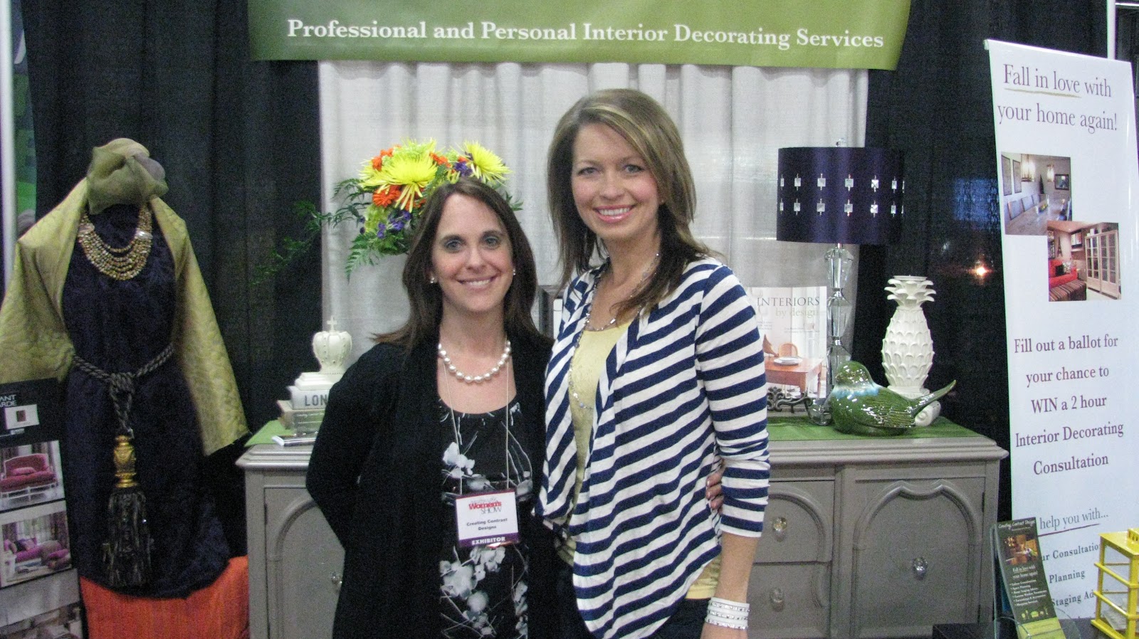
My fab friend Maria and I posing for a photo in my Creating Contrast Designs booth.  Cheers again babe!
Thanks to all my friends and clients who came out to see and support me at the show.  And thanks to those who stopped by to enquire about my services and completed a ballot to win a 2 hour Interior Decorating Consultation.  I will be doing the draw later this week and will be in touch with the lucky winner soon.  Good luck!

If you would like to find out more about the services I provide, contact me and I can help you create a beautiful space that you are happy to come to, share with your family and entertain in with friends. 

Monday, 30 April 2012

Take a few moments to relax and dream...aaahhh

Just feeling a bit of the blahs with it being Monday and rainy here in Burlington.  But what better way to brighten up the day than with some pretty pictures of sunny interiors! 

Find a quiet place, close your eyes just for a few moments and allow yourself to be swept away from the craziness of everyday life.  I don't know about you, but lately, things have been pretty crazy for me.  But that's life and I wouldn't change it for the world.  Although, it's okay to have to take a yoga moment every now and again, we deserve it.

Enjoy,  I hope it makes your day a bit brighter to help get you through the week!

I wish I was here...care to join me for tea on the patio??!

Not overly crazy about the decor, but the view...now that's something else.
Source
I envision stepping out onto the patio overlooking a lovely garden and just a walk to the beach! Bliss.
Reminds me of a place on the Greek Island of Santorini where I dined with other backpackers many years ago
Part of the craziness I have been dealing with for the past few months has been preparing for The Ultimate Woman's Show in Hamilton at the Careport Centre.   I am an exhibitor there for Interior Decorating (what else?!) and would love if you stopped by to see me. 

My booth number is #345 and  I have some '2 for 1' passes that I can e-mail to you if you are interested in attending the show.  Send me an e-mail:  claire@creatingcontrastdesigns.com   
I would love to see you there!  

Thursday, 19 April 2012

Wanna know some tricks of my trade?

People who don't understand the role of an Interior Decorator may think that it's a fun and easy job to do.  I can say this because when I first decided to attend college and follow my passion for Interior Design, I thought the same thing.  "Wow, what an exciting way to put my obsession with colours, fabrics, furniture and accessorising to good use!"  I was giddy at the thought!  How hard could it be?

Design fabulous spaces all day long...OMG!!!!

I absolutely love what I do and my desire to learn more each day never stops.  But although we may make it look easy to create the perfect space, decorators and designers know that there's a lot of thought and key considerations that go into each design to ensure it all comes together flawlessly. 

To create the perfect concept for a space, here are a few tricks of the trade to help you on your way.

Balance and Scale

Tall bedside lamps support the size of this headboard. Curves are repeated in furnishings & add a nice flow.

Bad judgement calls in balance and scale are one of the most common mistakes made when decorating a space. One way to ensure good balance within a room is to make sure furniture styles & sizes complement each other so pieces don't look out of place.

Pottery Barn
Balance does not necessarily translate into creating symmetrical designs only. Various sizes of  frames or uniquely shaped wall art hung randomly allows you to get creative.  Be sure though that one side does not feel 'heavier' than the other and that the overall look is balanced.

Hiding Unsightly Elements

Sometimes there are structural elements within a space that you simply cannot change and have to work around.  For many it can seem like an obstacle, but often it can be seen as an opportunity to use your imagination.


This fuse box in my home office had to be hidden, but remain easily accessible.  I saw these great cushion covers with my European theme and the pop of red so I had my seamstress cut them out and sew them onto black fabric.  I then went to Michaels and bought a canvas frame just the right size to place over the opening. Voila!  Easy, peasy.

Repeating Accent Colours

To give flow to your space, always try to repeat a main colour at least three times.  (By the way, 3 is a good number to remember when it comes to decorating, whether it be repeating colours or layering accessories etc.)
This ultra contemporary design highlights the popular orange hues in more than one way
The way in which you do this can come in different ways and by doing so you allow the eye to easily move around a space, as well as achieving good harmony in your design. 

There is a lot more than meets the eye when it comes to designing ~delicious decors~.  I'd love to hear about any challenges you've encountered in a design situation and how you resolved it.  There is always so much to learn, and I wouldn't have it any other way.

In saying that, I am off to an Upholstery seminar this evening at Paint It Like New which I am very excited about.  I will take lots of pictures and be sure to post soon to let you know what I learned.   In the meantime, I hope you enjoy your weekend!

Sunday, 25 March 2012

Pinterest - more than just pretty pictures

I am by no means a wiz on the computer, I much prefer to be decorating beautiful spaces.  However, I do recognise the importance of putting myself out there on the world wide web and have tried my best so far to spread the word about my passion for Interior Design.

Until recently there was one site that I was missing out on and if you don't already know about it, I'm here to tell you that  Pinterest is currently where it's at and I've joined!

Pinterest is an on line pinboard site that is currently getting a lot of traffic. After reading this article from my favourite blogger, Maria Killam, I decided that it was useless for me to deny it any longer. 

Pinterest is also a great place to show off your own work.  My office design doubles as a guest room.

Adding pinboards that I can show to client's when suggesting types of decor styles, finishes, fabric patterns, organising ideas and more will prove to be a great visual tool that could save a lot of time.

My Pinterest boards so far are categorised as the following:

My Work
Colour Schemes
Window Treatments
Nature
Seasons & Colour
Kitchens to Die For
Inspirational
Upcycled Furniture 


One of my favourite repins on my 'Upcycled Furniture' board

If you're looking for even more great ideas for your home's delicious decor, I invite you to follow me by clicking on the 'follow me on pinterest' button on the homepage of my website.   I will continue to add more pinboards with lots of pretty pictures that are sure to get your creative juices flowing! 


This living room is categorised under my 'Inspriational' board.

Boards coming in the near future include: Lighting; Creating Contrast; Patterns with Punch; Furniture Styles; Event Decorating & Aberfoyle Antique Market. I look forward to more pinning and providing you with fantastic ideas that I find throughout my searches.

Thanks again to everyone who supports and 'follows' me.  I hope you enjoy reading my posts and seeing what I get up to as much as I love doing it all.