Showing posts with label Benjamin Moore. Show all posts

Thursday, 3 May 2012

Stunning Basement Renovation not to be Missed!

I like to think that I have great vision for seeing the potential of unfinished spaces & visualising the final look of projects I embark upon. But once all is said and done and a job is complete, I am still amazed at just how much more stunning the result is is than I thought it would be. 

My basement renovation is no exception and I am thrilled to share these photographs with you.

Custom built ins designed by me and built by my talented husband Chris and our good friend Jeff.
 The rug is from HomeSense as are many of the accessories on display in the built in cabinet. The pot lights in the shelving are on dimmers and really highlight the accessories as well as adding ambiance.

Mirrored doors add sophistication and help to brighten up the space.

The mirrored doors were custom made and then sprayed by Paint It Like New in Benjamin Moore's Willow - CC542 - the same colour as the built ins. (Mirrors were sealed in after the paint had cured) I had the doors sprayed in a slightly higher sheen and opted not to add hardware.  The doors open easily enough and in my opinion adding handles would have been too busy with the mirrored inserts.

The other side of our basement is the dining/gaming area & is painted Wilmington Tan by BM.  

  Complimentary Colours - I love the purple hued drapery against the buttery yellow walls. 
The silk and polyester blend draperies add warmth and elegance to the space. I loved the Maxwell fabric that I used for this Living Room Makeover so much that I bought extra to use for the cornices (the fabric boxes over the curtains) and accent cushions on the sectional. 

The chalk board is a re-purposed item that I altered to be more functional.  Originally it hung horizontally and had a wire basket attached to the bottom.  I removed the basket, turned it vertically and super glued the small shelf under the board so the chalk would have a home.  We've already played darts and for the first time in ages I beat Chris, maybe the newly renovated space inspired my game!!

The various styled picture frames are unified by the same mat colour - Marshland - CC512 by Benjamin Moore.
Most of the frames I nicked from my Mom's inventory for the Aberfoyle Market - thanks Mom!  The photographs are from our travels across Europe and a few from Chris's time spent in Australia and Singapore. 

And do you recognise the buffet pictured above??  In this post I told you about my new (but old) piece of furniture and now you can see it completely transformed within my new space.  I love it!

It's been a very long journey but now when we sit back, relax and watch a movie - (I haven't even touched on the incredible surround sound system!) - we can really enjoy what we've accomplished.


'It's been a long time coming..it's well worth the wait' ~ Gord Downie, Tragically Hip

For more pictures please visit my updated website at www.creatingcontrastdesigns.com.  If you are thinking of starting renovations and need some guidance, please contact me and I can help you make your dreams for your home a reality.

Wednesday, 4 April 2012

Benjmamin Moore's latest Colours - Don't miss this post!

It's been a long time since Benjamin Moore has released a new colour palette.  Let's face it, I wouldn't be surprised if you're wondering like me what other colours could possibly be missing from their current collections?

In the newest Colour Stories series, Benjamin Moore introduces rich colours with an intensity so deep and true you can almost taste their flavours!  They have categorised each colour palette by colour which makes it easier to navigate your way through the system & is just one of the refreshing differences in this new colour line up.


Fiery sunset is one of eight volumes from Colour Stories

So, what else makes this series unique?  After recently attending a Designer Gala hosted by West Appleby Paint and Decorating Inc. featuring guest speaker  Leigh-ann Allaire Perrault  (Benjamin Moore's Colour & Design expert often seen on City Line) allow me to bring you up to date on this exciting and brilliant new collection. 

The paint chips are larger and are 'aura painted' not printed

Colour Stories paint colours have no black or gray added to them and are made up of 5-7 pigments instead of the usual 2-3 pigments.  Complimentary colours have been used to make these intense, rich hues and  for this reason the colours appear to be much more saturated even when compared to their affinity line. 

There are 8 'volumes' of 240 full spectrum colours to choose from that take on different characteristics and appearances throughout the day.  I will be interested to see how the paint colour will look in both natural and artificial light in 'real life' decor.

Photograph from the 'Naturally Neutral' volume
Benjamin Moore has branded themselves as colour professionals that can predict trends of what's up and coming for the future.  Travelling all over the world they research the economic markets; investigate which natural resources are being used and of course follow the fashions on the hottest runways. 

Based on what they observed in various countries Benjamin Moore Colour experts analyse collected data and review past trends.  Predictions and 'Colour Forecasts' are established stating what consumers will desire and seek out in everyday life.  Colours chosen are to satisfy certain needs within us, evoke specific emotions and reflect current economic times.

~Euphoria erupts as the intrepid climbers reach the breathtaking summit of their South American destination ~

Andes summit - CSP600 - violet twilight volume - BM Colour Stories
Every colour tells a story (as above) & each story allows you to conjure up images of the people and places that may have inspired the creation of that colour.  I've often thought that having the job of choosing names for paint colours would be fun.  Some of my favourites from Colour Stories are: hannah banana; worn leather shoes; soho loft; bellbottom blues; barefoot in the grass & 14 carrots.


This ad was in my latest Style at Home Magazine and I can't help but smile every time I look at!

I am excited to use some of these colours in upcoming decorating projects and will be sure to provide you with feedback once I do.  If you've tried out any of the Colour Stories paint hues I would love to know what you think of them.

Not sure how to select the colours you need for your space or confused by the all the options available to you?  Contact me for a colour consultation and let me help you rejuvenate your space!
Visit my website at www.creatingcontrastdesigns.com for all my contact information.

To subscribe to my blog please enter your e-mail address in the right column at the top of the page and you will never miss a post!


Wednesday, 28 March 2012

A Sneak Peek at what's to come in colour and fashion...

'Colour Stories' is an exciting new series of paint colours from Benjamin Moore.   Last night I attended a Designer Gala with guest speaker Leigh-Ann Allaire Perrault of Benjamin Moore and City Line where she proudly introduced this new line of 240 full spectrum colours.


Colour Stories Fan Deck

These colours have more depth and intensity than other colours because of the unique make up of the paint that also allows the colour to change with the light and is almost impossible to duplicate.

From the 'Earth & Sky' Eco Trend Palette of BM Colour Stories
These colours are unique as there is no black or gray added and they are made up of 5-7 pigments instead of the usual 2-3 pigments used in most paints.  I will be dedicating a post to the 'Colour Stories' shortly and reveal some of the stunning palettes that I was privy to last night, stay tuned!!!

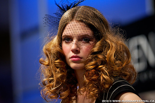
On another note, this weekend I will be working the ABA show in Toronto.  I've worked this show every year for the past 7 years & I'm always eager to see what wild and gorgeous hair and make up fashions are adorned on each stage.  Exhibitors include Loreal; Redken; Matrix, Wella and more.

Source
It is no secret that what we see in fashion eventually resonates and is filtered down to our home decor. For this reason you can bet I will be keeping my eye on what colours are hot, styles of hair design,  accessories adorned by the models and of course, the fashion.  And as always, I will be blogging about these latest trends upon my return.  Enjoy the rest of your week!
 
The work that goes into these creations is amazing

Friday, 6 January 2012

Living Room Makeover - Part 1

When I first meet with clients I ask them why their current space is not fulfilling their needs.  We discuss function, colour & style preferences as well as how they would like to 'feel' when they enter that particular room.  Like anything in life it is important to understand why you want to change something before you look at initiating that change. To see more about questions asked during the consulting stages,  click here to read my post about 'Where to Start'.  

When I first met with Dorothy and Geoffrey their living room was painted a dark green tone & there was no fixed lighting in the room.  They wanted the room to be brighter & wished to update the decor by using some of their  beautiful antique items and introducing modern furnishings as well.  

We discussed what furniture was staying, what could be re-worked and what was going to need replacing.

A large tree outside their window blocks a lot of natural light from entering the room.
We discussed how many people they typically entertain for so as to clarify what seating was required.  To address the lighting issue I suggested placing sconces on the wall by the fireplace and adding secondary lighting with floor and table lamps, as drilling into the ceiling was not an option. 

The fireplace had hand painted floral Portuguese tiles and if they were to stay, they would have limited and dictated the style and colours for the room.  It really was essential to replace these tiles to update this room and give it the face lift my client's desired.

Carrara Marble Tiles with the brass insert gives this fireplace a clean, classic and polished look. 
The floor had some damage to it so it was sanded down and re-stained with a natural look finish.  An area rug is a great way to add softness to a room and will help ground the space.  However, until one has been chosen, my client's are enjoying their gorgeous hardwood floors! 

Prior to finalising the paint colour I recommended painting 18" x 18" samples with the 2 colours that they liked best and place then on a larger white background on the wall for 48 hours.  It is important (and surprising) to see how colours change throughout the day and into the evening, so I always encourage this exercise prior to applying the paint.  I know people say 'It's only paint' but by doing this and getting it right in the first place saves a lot of time and headaches in the long run.

  Paint - Benjamin Moore- HC99 - Abingdon Putty.  Still to come -wall art, a rug, coffee table & accessories.

As you can see, the room has been totally transformed and looks stunning.  My client's are thrilled with the way it is coming along and so am I.  We started work on this project in September and were fortunate to have all of the upholstered pieces and draperies completed and recieved before Christmas. 

When ordering customised items it's important to be aware of  timelines for delivery in order to manage expectations (yours or your clients) thoughtfully and carefully.   As I've mentioned before, HGTV makes this business & the process of Interior Design look quick and easy -that just isn't the case.

To see the professional photos - which are stunning!! - head here to the portfolio page of my website.  

If you wish to sign up to my posts, please do so by clicking here.  There is always more fabulous advice and design tips at your finger tips!

Sunday, 20 November 2011

Before and After Pictures

My piece of furniture is done and I love it!  Unfortunately my basement is undergoing some renovations at the moment so it will be a while until I can move it to it's new home.  Here is a picture of my buffet and if you didn't see what it looked like prior to being sprayed, then click here to see the photo.  To see it in my beautifully renovated basement all dressed up and pretty, read this.

I am very pleased with the colour and can't wait to add hardware and dress it up with accessories.

Paint it Like New has done some amazing work and I am dedicating this post to sharing some of my favourite before and after transformations with you.  If you are still hungry to see more once you've read this post, please go to their  website for lots of other pictures that are sure to inspire!

Oak cabinets tend to require an extra coat or two of paint because of the nature of the of the wood.
One of my clients had oak cabinets like this and then had them sprayed CC 130 - Ivory White by Benjamin Moore and it looks fantastic.  The hardware still needs to be chosen but I can tell you that the difference in the overall look of the kitchen is amazing.  Even with Oak cabinets the make over will still look incredible when it's done, just look at this kitchen below!

New back splash & counter top to be installed.  This kitchen will be as good as new for a fraction of the price!

Many people have their kitchen cabinetry painted because it is a quick and cost effective way to beautifully update a kitchen.   Creamy Whites are usually the most frequently requested colours, like Benjamin Moores' cloud white, oxford white or steam - from the affinity collection.

Although when other colours are used such as black or an espresso, they tend to have a more customised look as well as covering up any imperfections better than white can.  Janet especially loves when customers' request to paint something a funky colour too, which leads me to this next item. 

Here is another buffet before being painted.
And here it is after.  How bold and fun!
This bright orange hue for the buffet is risky but it works sensationally with  the wallpaper and I'm sure it is the conversation piece of the entire house! 

These pictures below are of  4 very cool planters that would make a statement in any garden or porch.

I have to admit I kind of like the character of the worn and weathered look, but.....

How fierce do these lions look now?!!
If you have something you are considering having painted to freshen up its' appearance, contact Paint It Like New and Janelle would be more than happy to provide you with a quote.  If you would like to give something new life but don't have anything yourself, check out  Upcycle Furnishings.   You can choose from one of the pieces for sale and pick the colour to best suit your decor.  Here is a previous post on Upcycle furnishings if you are looking for some ideas.

I am very excited to announce that Creating Contrast Designs has teamed up with Paint It Like New to offer the following Christmas promotion:   Simply visit 'Paint It Like New' between November 24th and December 24th and be entered into a draw to win $100 towards your next spray painting project and a two hour Interior Decorating Consultation.  The winner will be drawn on Christmas Eve and will be notified by phone or e-mail.  What a great way to start off the Christmas holidays!

My first Christmas newsletter will also be sent out this week to all my subscribers.  If you haven't subscribed and you don't want to miss out on my 'Top Ten Tips for Home Decor at Christmas' then be sure to subscribe at the top right side of my blog and enter your e-mail address.