People who don't understand the role of an Interior Decorator may think that it's a fun and easy job to do. I can say this because when I first decided to attend college and follow my passion for Interior Design, I thought the same thing. "Wow, what an exciting way to put my obsession with colours, fabrics, furniture and accessorising to good use!" I was giddy at the thought! How hard could it be?
| Design fabulous spaces all day long...OMG!!!! |
I absolutely love what I do and my desire to learn more each day never stops. But although we may make it look easy to create the perfect space, decorators and designers know that there's a lot of thought and key considerations that go into each design to ensure it all comes together flawlessly.
To create the perfect concept for a space, here are a few tricks of the trade to help you on your way.
Balance and Scale
| Tall bedside lamps support the size of this headboard. Curves are repeated in furnishings & add a nice flow. |
Bad judgement calls in balance and scale are one of the most common mistakes made when decorating a space. One way to ensure good balance within a room is to make sure furniture styles & sizes complement each other so pieces don't look out of place.
| Pottery Barn |
Balance does not necessarily translate into creating symmetrical designs only. Various sizes of frames or uniquely shaped wall art hung randomly allows you to get creative. Be sure though that one side does not feel 'heavier' than the other and that the overall look is balanced.
Hiding Unsightly Elements
Sometimes there are structural elements within a space that you simply cannot change and have to work around. For many it can seem like an obstacle, but often it can be seen as an opportunity to use your imagination.
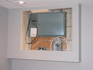
This fuse box in my home office had to be hidden, but remain easily accessible. I saw these great cushion covers with my European theme and the pop of red so I had my seamstress cut them out and sew them onto black fabric. I then went to Michaels and bought a canvas frame just the right size to place over the opening. Voila! Easy, peasy.
Repeating Accent Colours
To give flow to your space, always try to repeat a main colour at least three times. (By the way, 3 is a good number to remember when it comes to decorating, whether it be repeating colours or layering accessories etc.)
 |
| This ultra contemporary design highlights the popular orange hues in more than one way |
There is a lot more than meets the eye when it comes to designing ~delicious decors~. I'd love to hear about any challenges you've encountered in a design situation and how you resolved it. There is always so much to learn, and I wouldn't have it any other way.
In saying that, I am off to an Upholstery seminar this evening at Paint It Like New which I am very excited about. I will take lots of pictures and be sure to post soon to let you know what I learned. In the meantime, I hope you enjoy your weekend!


No comments:
Post a Comment