Showing posts with label fabrics. Show all posts

Monday, 18 June 2012

Wallpaper and Fabrics from Crown

I frequently attend seminars, workshops and trade shows related to interior design to ensure that I am keeping current in all aspects of my industry.  Recently I went to a seminar to view some wonderful wallpaper and lovely fabrics by Crown, who are celebrating their 75 year anniversary.  Happy Anniversary to you!
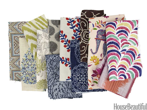
Some vibrant colours and prints with an 'organic' feel

Pictured above and below are the latest Asian inspired prints by John Robshaw that are exclusive to Crown.  Johns' prints are famous for his 'block printing' style and the way that he layers  designs onto fabrics.  For more information on John Robshaw, click here and tour his website to see where in this fascinating world he finds inspiration.


To me, these complimentary blues and oranges have an earthy feel to them.

Crown have 3 main fabric lines: Duralee; Highland Court and Suburban Home.  The latter is their economy line, but the prints are still chic and very much in fashion.  They offer many linen look fabrics with detailed embroidery such as this one below.   This colourful fabric would be the perfect jumping off point to inspire an entire rooms' decor palette.

Colour 23 - Peacock. 

Here are some more lovely prints from the 'Enchanted Collection' of Suburban Home Fabrics.

The representative from Crown told us that they are seeing a lot of dots in fabric designs.


Cheerful Cherry Blossoms.  Pattern #71050. Colour #165 Bordeaux

If you like a specific pattern you may find that it is available in other colours as well.  When you are looking at fabrics in a book, always read the label as there is a lot of important information provided here. Ask a store owner or your Decorator to break it down for you into a language that is easier to understand if you are not familiar with the terms that are used.

Double Rub Count refers to the durability of a fabric. The higher the count, the more durable the fabric.
Crown is well known for their fabulous wallpaper collections too.  My favourites are from the Crown Studio 465 Collection which are themed by different famous cities across the world.  Perfect for either residential or commercial applications, these wallpapers can help you set the tone with cultural influences from a certain place.

For some more edgy designs, the London or Las Vegas lines are very cool...
 
Too contemporary for my own style, but the Union Jack always puts a smile on my face.
The wallpaper behind the strong and impressive Union Jack Canvas mimics the map of London's underground subway which is referred to as the 'tube'.


The Las Vegas books have funky patterns & also incorporate classy styles as well.


Viva Las Vegas
This wallpaper name is 'Jubilee'. I really like the subtle difference in the 2 colour tones of the design.

Wallpaper nowadays comes with a 'no fuss no muss' application compared to years ago when you had to play with the paste.  Although if you are still uncomfortable at the thought of doing this yourself, it may be a good idea to have an experienced trades person do the job for you.

Wallpaper can be pricey so be sure to take correct measurements of your required square footage, as with anything it's better to have extra than not enough.  Be adventurous and use a wallpaper you absolutely love for an accent wall or for an entire room - I dare you!! Please send pictures of a project you have done, I would love to see them.

To recieve all my blog postings, please subscribe to ~delicious decor~ by entering your e-mail address at the top right of my blog.  Have a happy day!

Tuesday, 5 June 2012

Passionate about Patterns, a continuation...

Incorporating patterns within a space is a fabulous way of establishing a style or setting the tone for a decor project.  In researching for part one of my 'Passionate about Patterns' post, I quickly began to realise that -WOW, there are a lot of patterns out there! 

Feeling blue? I adore the nautical feel of crisp blues and whites.

Although I am exposed to various patterns all the time,  even I was blown away with the countless designs that continued to emerge.  I guess I never actually stopped to consider just how lucky we are to have such a variety to choose from. 

So now, if I can get over my 'A..hah' moment, let's look at some more patterns!

Herringbone - simply put - An arrangement of rectangles

Love the contrasting colours of a herringbone design on this table top
Herringbone is a popular and classic choice for flooring as well.   It has been used in retail commercial applications and I recall seeing it often in old estate homes in England.

Warm and weathered herringbone flooring contributes to a natural feel in this room of understated elegance.
A pattern very similar to the Herringbone is the Chevron design.  Until now, I never really considered that there was a difference between Chevron and Herringbone - or maybe it's better to say that I just never gave it a second thought in the first place.  

Chevron - an inverted 'V' shape pattern

So not my personal style, but man do I love this room!

I found this article from 'apartment therapy' that describes & illustrates the subtle difference between these 2 similar designs. I will dedicate a post solely to the 'herringbone' and 'chevron' patterns in the near future because I just adore how versatile and timeless these designs can be.

Houndstooth - a duo tone textile pattern characterised by broken 'checks' or abstract four-pointed shapes, often in black and white. Wikipedia definition

This pattern has long since been one of the favourites on fashion runways around the world.

Source
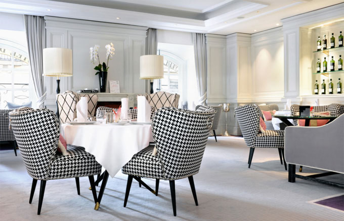
But houndstooth is also very prevalent in home decor.  Pictured below is the 'Hotel de Vendome' in Paris where the houndstooth design has been used on the upholstery fabric for the chairs and...

So clean and fresh, I wish to sip wine here during a posh lunch appointment. Care to join me?! Say 'Oui!'

...on the bar stools.
The black and white pattern paired with the baby pink is soft and so cute.

When decorating, bear in mind how many different patterns you want to include in your space.  As we have observed, patterns are not limited to fabrics but can be seen all around us in many areas such as flooring, accessories, tiles and more.  Be careful not to go too crazy with patterns (like I showed you in this post) - or your eyes will not have a place to rest.

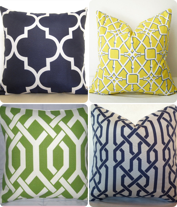
Lattice - typically known for its' diamond design (like the picture below) but today there are many variations in this repeat vertical pattern.


This radiator cover plays double duty with a shelf to display accessories as well.

Fun accent pillows

And my favourite...

Room divider, accent cushion and wall paper lattice designs. What a fresh office space.
With so many patterns styles & colours to choose from, you can be overwhelmed with choices. If you want professional advice for mixing patterns in your space please do not hesitate to contact me.  I can help you fall in love with your home again!  My new cell number is 905-599-2588. 

Tomorrow I am off to Toronto for a 3 day workshop to become a True Colour Expert.!!  This course is with Maria Killam, a decorator, blogger, author and internationally sought after colour expert from Vancouver.  I am so excited to attend this course and you can be sure I will be taking pictures and posting about it all very soon.


Thursday, 12 January 2012

Living Room Makeover - Part 2

When embarking on a new project it is often the case that you may already possess items that you want to incorporate into your rooms' decor.  Or while on your travels in search for inspiration you come across an accessory, fabric or picture that becomes your 'jumping off point' for the room.

When I began to source fabrics for Dorothy and Geoffrey's living room Maxwell Fabrics had just launched a new line that I thought would be worth showing them samples of.  We had already discussed ideas for a colour scheme based on hues they were drawn to so I had a good idea of what to look for. 

This is the fabric sample, but the picture really does it no justice.
You need to touch and hold this fabric to truly appreciate it's beauty.  The colours are rich, yet soft and the extra layer of fabric over top the background gives it added texture.  It was decided that this fabric would be used for the draperies and as the inspiration piece for the room. 

The colour you don't really notice from the picture above is the lavish plum that is used for the colouring of the florals with the green and gold.  I suggested that the lead edge of the draperies should be this colour to compliment the purple hue within the pattern. 

 Tiebacks will be added to gently pull the curtains to the sides to allow for maximum light

The draperies were made with 6" pinch pleated goblets and come just to the floor.  When choosing fabrics for custom window treatments it is important to show a sample to your workroom or seamstress so they can confirm that the material is suitable for the application you have in mind.  This fabric is quite thick, therefore once hung they were very full bodied which enables you to admire the beauty of the entire pattern.

These 2 carved walnut Victorian parlour chairs were in unbelievably good condition considering they must be from the late 1800's.   It was agreed however, that they were ready for an updated look. 

The curves of the hip rails and cabriole legs add to this chairs delicate appearance.
This is the 'Mama' chair re-upholstered in plum velvet.
Lillian August offers some of the most exquisite fabrics and this plum velvet was no exception.  We used this 'Dewitt Plum' on the front of the chairs and for accent cushions on the sofa. I suggested using the same Maxwell fabric on the back of the chairs that had been used for the draperies to give it a special touch and additional flow to the room's overall design.

If I'd added throw cushions in this same fabric it would have been too 'matchy matchy'.


Their wing back chair was re-upholstered in a Robert Allen striped fabric.   The colours are more muted but still carry the similar tones of the draperies, minus the plum.  This chair was originally in my client's bedroom and when I saw it I asked if they would consider moving it into the living room.  Always look at what can be re-worked or upcycled from other areas of your home before purchasing new items.  You may just be surprised at what you find!

The camel back sofa with a skirted bottom was a custom purchase that quietly fits in with the style of the room.  The throw  cushions compliment the rooms' colour scheme and the pattern of the golden cushions  bring a more modern feel without being too 'loud'.

Finishing touches have yet to be added.   Photographs were taken by me, please excuse the angle, lighting etc.

I love mixing old and new pieces together to give a one of a kind look.  If you have antiques don't be afraid to include them into your decor, but be sure you have other antique items to support your eclectic style so that they don't look out of place. 

If you want to know a great place to buy older pieces of furniture, check out Aberfoyle Antique Market (one of my fab finds!) when it opens again this spring.  Be sure to read this prior to your visit and you will be better prepared for what to expect and how to shop with confidence.

If you like this living room makeover and are considering a renovation or decorating project of your own, please e-mail me at claire@creatingcontrastdesigns.com. I will be more than happy to help make your dreams for your home a reality.