Showing posts with label colour. Show all posts

Thursday, 12 July 2012

Colourful creatures to inspire your home decor

The other day my 8 year old son was on the computer downloading pictures and organising them into folders of his favourite animals.  I asked him if I could see which ones he'd saved so far and it gave me an idea for a new posting - suprise suprise!

Instead of the usual fashion comparisons, why not get inspiration from wildly colourful creatures for your home decor?  I am going to have some fun here & I hope you enjoy what I've come up with!

what a cute little chameleon!
Vivid colours on this chameleon could be used for a fun palette resembling something like this.....

Casual and colourful cottage living room
The colours on this lovely 'Yellowtail' fish with deep purple and yellow markings are intense.

More blue violet in other pictures I viewed, but very sharp all the same

Complimentary colours are always a hit when used together


This furry friend has great colour and I actually found 2 rooms that he could have inspired.

Source
First is a lovely bedroom with many natural characteristics....

I love the bird cage decals over the bed

And here is a lively dining room, complete with aviary accessories!

This fun bright accent wall reminds me of Benjamin Moore colour 'Grape Green' 2027-40

This frog is probably poisonous and meaner than he looks, but great inspiration all the same!

Black and yellow offer fantastic contrast

Clean and bright bathroom with tufted fauteuil accent chair.

Source

You can find your jumping off point almost anywhere.  Choose something you absolutely love and go from there.  If you want some help pulling your space together flawlessly, contact me and I can help make your dreams for your home a reality.  http://www.creatingcontrastdesigns.com/ 


Monday, 25 June 2012

Let me talk clean and dirty to you

Undertones, cool vs warm and  sun exposure are all factors that need to be taken into consideration  when choosing colours.  I want to peel back yet another layer of the complex world of colour by explaining and helping you to identify the differences between 'clean' and 'dirty' colours.  This was a large part of our discussions during my  True Colour Expert course & is very relevant in home decor.

Compare, compare and compare again!

During a colour consultation, I spend a lot of time comparing colours with clients.  Only by comparing can you truly see how colours relate to one another and how one will be a better choice to match a certain tile, carpet, fabric etc. than the other. This is largely due to the fact that every colour has an undertone.  

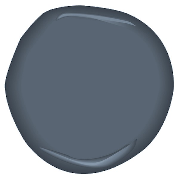
Currently I am craving a more muted or 'dirty' blue hue similar #89 'Lulworth Blue' or #237 'Cook's Blue'

The blue that I have been yearning for lately may be completely different to what someone else is thinking is their favourite shade of blue.  The only way to know for sure is to compare.  Looking at the Farrow and Ball shades of blue (above) you can see how some blues are more of a greeny blue and others are more purple - all because of their undertone.

This blue wall colour is nice, but much more 'fresh' that what I am looking for just now.
When putting together a colour palette it is imperative to create a smooth transition from one living space to another.  When I look at colour with clients, most understand the difference between light and dark or cool and warm colours, but this third element of 'clean' and dirty' is where the majority of mistakes are made when decorating. 

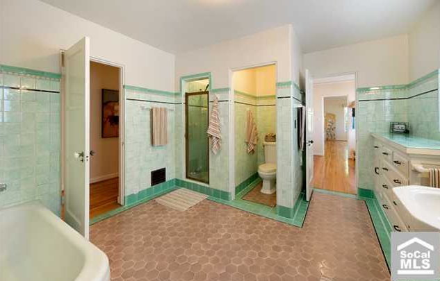
Imagine how much nicer this room would look if the flooring was a crisp, clean white tile

This picture from Maria Killam is one of the best examples of the clean & dirty comparison.  The  green wall tiles make the honey comb patterned flooring look as though it hasn't been cleaned in quite some time.  Or you could say that the green tile is a clean colour and the flooring is a dirty colour.

Here are other examples of where clean and dirty tones have been mixed in home decor.

In the above photograph, no one can dispute that the curtains and the amimal-esque statues either side of the large cabinet are yellow. However, the accessories are a bright (clean) yellow in comparison to the curtains which when placed next to these bright items, appear 'dirty'.

The living room (below) has a soothing greeny blue colour on the accent wall with creamy shabby chic styled furnishings.  While the turquoise painted legs on the tufted bench are bright (clean) in comparison to the soft muted (dirty) tones of the wall and the buffet.

 Although this bright turquoise does a nice job of co-ordinating with some of the glass accessories,  it is much cleaner that the rest of the calming tones used in this room. 

Bear in mind that when looking at clean and dirty comparisons, you can almost always find a colour that is more dirty or more clean than another.  See below for a final comparison:

The colour Corn Silk (below) is cleaner than Golden Straw.

However, Golden Straw (below) is the cleaner colour when compared to Powell Buff.
And I'm sure we could find colours dirtier than Powell Buff and cleaner that Corn Silk and so on and so forth.  Take a look around your ~delicious decor~ to see if you've mixed any clean and dirty colours.

I won't lie to you, in my kitchen I have a  dirty back splash and clean cookie jars. Thankfully the jars are minor accessories that I can easily change rather than a fixed element that would drive me crazy now that I have trained my eye what to look for.  

If  this is as clear as mud to you, don't panic!  Contact me, a Certified True Colour Expert.  I can help you choose the best clean or dirty colours for paint, back splash, flooring and furnishings to make you fall in love with your home again. 

Sunday, 10 June 2012

I am officially a Certified True Colour Expert!

The recent 3 day True Colour Expert Workshop I attended in  Toronto was eye opening and informative.  Maria Killam -Decorator, Blogger & Colour 'Guru' from Vancouver - teaches decorators, designers and colour enthusiasts her process for choosing colours.  There were many hands on exercises which is the best way to learn, especially for us decorators who need to touch & feel pretty much everything! 

Meeting Maria was very exciting for me. She is such a sweetheart and her laugh is contagious!
It felt like Christmas everyday when we arrived to class as there were always little goodies neatly waiting for us (pictured below).  We were provided with quartz samples, Benjamin Moore fan decks and Robert Allen note pads.  We were also given 3 Gentek fan decks - 2 for exterior paint colours and 1 for choosing aluminum colours.  Since returning, hubby and I have already discussed what changes we want to make to the exterior paint colour of our house to update it's look!


A main focus point of the course was understanding and learning how to identify undertones. Maria's e-book 'How to Choose Paint Colours - It's all in the Undertones' gives a good overview and understanding of the complex world of colour.  Of course, being the keener that I am, I had already purchased, printed, binded and read this book months ago!  


If you have the book, I recommend inserting actual paint chips from Benjamin Moore so you can see the colours accurately. The colours faded when I printed my copy and it makes a big difference especially when so much of Maria's book and theory refers to comparing colour.  

I used photo corners to insert the chips. Sorry my picture is not great quality, but you get the idea.

Constant comparison of colours is necessary when showing clients how and why you are choosing a specific colour for their space.   I never go to a consultation without Maria's large samples and I will be painting more large samples to expand my collection in order to bring client's even a greater selection to choose from.  The process of elimination is also important and can be the best way to start if you are ever unsure.

Out for dinner with the group - what a fantastic bunch of ladies!
One of my favourite reasons for attending workshops such as this is that I get to meet other fabulous people within the field of design.  It is such a great way to network and learn from others who are just as passionate about ~delicious decor~ as I am.

Many participants had made the trip from America and one lady (Jennifer) had come all the way from Hawaii!  It goes to show that Maria is  an inspiration to so many people around the globe.   Thanks to Maria and to all the lovely ladies who openly shared their experiences and stories.  To see more on the latest True Colour Expert Workshop, read Maria's latest post by clicking here

Subscribe to ~delicious decor~ for all things related to interior design, upcycling and repurposing,  please enter your e-mail address at the top right of my blog.  This way you will never miss a post!

If you want to 'Fall in love with your home again' contact me, Claire Jefford ~ Certified Interior Decorator and True Colour Expert.~  I will help make your dreams for your home a reality.  claire@creatingcontrastdesigns.com

Wednesday, 6 June 2012

Certified True Colour Expert - Coming Soon!

I am so ecstatic!!  Today I am heading to Toronto for a 3 day True Colour Workshop presented by Maria Killam.  I can't wait to expand my current knowledge on the complex world of colour, undertones and how it all relates to every single element within design.  Meeting Maria and others who share the same passion about colour and all things Interior Design is totally pumping me up.

This little cutie's expression sums up how I am feeling!!


I believe you can never really know it all in this business, which is why I love it so much - there is never a dull moment!   I have heard that Maria's courses are very informative, fun and that there is a lot of hands on work involved. I am ready to dig deep... bring it on!  I look forward to sharing my experience with you soon.  (can ya tell I'm a bit giddy??!!)

Enter your e-mail address below to subscribe to ~delicious decor~ and find out all about it!  

Wednesday, 4 April 2012

Benjmamin Moore's latest Colours - Don't miss this post!

It's been a long time since Benjamin Moore has released a new colour palette.  Let's face it, I wouldn't be surprised if you're wondering like me what other colours could possibly be missing from their current collections?

In the newest Colour Stories series, Benjamin Moore introduces rich colours with an intensity so deep and true you can almost taste their flavours!  They have categorised each colour palette by colour which makes it easier to navigate your way through the system & is just one of the refreshing differences in this new colour line up.


Fiery sunset is one of eight volumes from Colour Stories

So, what else makes this series unique?  After recently attending a Designer Gala hosted by West Appleby Paint and Decorating Inc. featuring guest speaker  Leigh-ann Allaire Perrault  (Benjamin Moore's Colour & Design expert often seen on City Line) allow me to bring you up to date on this exciting and brilliant new collection. 

The paint chips are larger and are 'aura painted' not printed

Colour Stories paint colours have no black or gray added to them and are made up of 5-7 pigments instead of the usual 2-3 pigments.  Complimentary colours have been used to make these intense, rich hues and  for this reason the colours appear to be much more saturated even when compared to their affinity line. 

There are 8 'volumes' of 240 full spectrum colours to choose from that take on different characteristics and appearances throughout the day.  I will be interested to see how the paint colour will look in both natural and artificial light in 'real life' decor.

Photograph from the 'Naturally Neutral' volume
Benjamin Moore has branded themselves as colour professionals that can predict trends of what's up and coming for the future.  Travelling all over the world they research the economic markets; investigate which natural resources are being used and of course follow the fashions on the hottest runways. 

Based on what they observed in various countries Benjamin Moore Colour experts analyse collected data and review past trends.  Predictions and 'Colour Forecasts' are established stating what consumers will desire and seek out in everyday life.  Colours chosen are to satisfy certain needs within us, evoke specific emotions and reflect current economic times.

~Euphoria erupts as the intrepid climbers reach the breathtaking summit of their South American destination ~

Andes summit - CSP600 - violet twilight volume - BM Colour Stories
Every colour tells a story (as above) & each story allows you to conjure up images of the people and places that may have inspired the creation of that colour.  I've often thought that having the job of choosing names for paint colours would be fun.  Some of my favourites from Colour Stories are: hannah banana; worn leather shoes; soho loft; bellbottom blues; barefoot in the grass & 14 carrots.


This ad was in my latest Style at Home Magazine and I can't help but smile every time I look at!

I am excited to use some of these colours in upcoming decorating projects and will be sure to provide you with feedback once I do.  If you've tried out any of the Colour Stories paint hues I would love to know what you think of them.

Not sure how to select the colours you need for your space or confused by the all the options available to you?  Contact me for a colour consultation and let me help you rejuvenate your space!
Visit my website at www.creatingcontrastdesigns.com for all my contact information.

To subscribe to my blog please enter your e-mail address in the right column at the top of the page and you will never miss a post!


Wednesday, 28 March 2012

A Sneak Peek at what's to come in colour and fashion...

'Colour Stories' is an exciting new series of paint colours from Benjamin Moore.   Last night I attended a Designer Gala with guest speaker Leigh-Ann Allaire Perrault of Benjamin Moore and City Line where she proudly introduced this new line of 240 full spectrum colours.


Colour Stories Fan Deck

These colours have more depth and intensity than other colours because of the unique make up of the paint that also allows the colour to change with the light and is almost impossible to duplicate.

From the 'Earth & Sky' Eco Trend Palette of BM Colour Stories
These colours are unique as there is no black or gray added and they are made up of 5-7 pigments instead of the usual 2-3 pigments used in most paints.  I will be dedicating a post to the 'Colour Stories' shortly and reveal some of the stunning palettes that I was privy to last night, stay tuned!!!

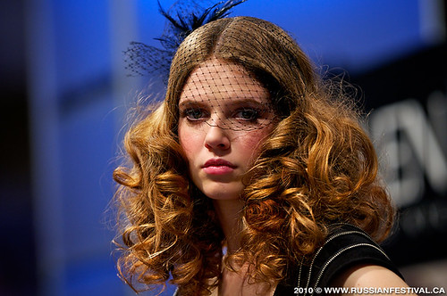
On another note, this weekend I will be working the ABA show in Toronto.  I've worked this show every year for the past 7 years & I'm always eager to see what wild and gorgeous hair and make up fashions are adorned on each stage.  Exhibitors include Loreal; Redken; Matrix, Wella and more.

Source
It is no secret that what we see in fashion eventually resonates and is filtered down to our home decor. For this reason you can bet I will be keeping my eye on what colours are hot, styles of hair design,  accessories adorned by the models and of course, the fashion.  And as always, I will be blogging about these latest trends upon my return.  Enjoy the rest of your week!
 
The work that goes into these creations is amazing

Thursday, 8 March 2012

Spring Fever, pass it on!

Earlier in the week we had some amazingly beautiful weather that has pumped me up for the spring season ahead!  I have been booking more colour consultations for the upcoming weeks and I'm positive that spring being just around the corner has a lot to do with that.  This is a great time of year to easily freshen up your home's decor by changing wall colours or adding bright pillows and pretty flowers to give you the fix you may be craving.  

How lively are these colours!?! Spring inspiring!!!

With the onset of spring comes Easter & images of fluffy cotton tails.  The picture below reminds me of the delicate pastel colours I would use as a child to paint Easter eggs.  I can't wait to get creative while egg painting with the kids this year, it's so much fun!  If you find yourself decorating eggs, why not use them to adorn some branches either inside or out to add a playful look to a vignette.

Source

Dont' be afraid to get 'carried away' with colours this spring time, it will make you feel good!

Blue skies, soft buttery sunlight and balmy temperatures naturally gets us in the mood to clean, organise and liven up our surroundings. Spring fever is just the excuse you've been waiting for to change things up.

If you want to add some colour to your space and would like advice in doing so, contact me and I will help you fall in love with your home again.  You can find all my contact details on my website: www.creatingcontrastdesigns.com

Revitalise your ~delicious decor~ by injecting pops of colour to every area of your house, I guarantee it will make you feel happy and lift your spirits!

Friday, 24 February 2012

Why more than one Accent wall can be boring

When considering what colours to use in a space it can be daunting  to decide on a bold hue or wild wallpaper pattern for an entire room.  Over the years accent walls have become a popular way to add hits of colour to a home's decor, but knowing when to use this application is key to getting it done right without going overboard.  

I am loving this room
This week I met with a previous client for a colour consultation in her new home. She just bought a gorgeous rustic styled house in the country and wanted help deciding on colours for her main floor.  She is not afraid of colour (yay!) and was thinking of a dark hue in her dining room/entry way.

I suggested Mysterious AF565 by Benjamin Moore for an accent wall to give her the fix she was looking for.  One reason I advised going with an accent wall rather than painting the entire room that colour is because it  would've been too dark when we considered all the other elements within this space -the major consideration being the lack of natural light. 

This is the only accent wall that I recommended during the consultation and this is the reason why:

Wall Colour Mysterious adds gorgeous drama to any space

Although accent walls are a fantastic way to add drama and create a focal point in a room, if repeated more than once within your main living space the concept can lose its appeal quite quickly. I have been in homes where every room in the house has had an accent wall. The first time you see this it's fun and interesting but after the third room it becomes tiresome and for me, a disappointment.

What little girl wouldn't like a splash of pink in her room?
Kids bedrooms (and more private rooms in general) are a different story and you could get away with having a wall highlighted in each of these rooms if you really wanted to.  Afterall, it's often the case that if you do something for one child, chances are your going to have to do it for the others too!


This unique accent wall adds a rustic coziness to an otherwise modern plain room.
The thought of having one bold colour or wallpaper print on all your walls for long periods of time can seem like a lifetime commitment that you may not be ready to make.  If this is the case for you then going with an accent wall could be the way to go.

If you love surrounding yourself in colour then why not paint all 5 walls (the 5th being the ceiling) in a hue you love and makes you feel happy?  I dare you!  If your a bit more on the conservative side remember that there are other ways to inject life into a rooms design.  With the current colour trends options are limitless for colourful accessories, patterned draperies, painted furniture, funky rugs- the list goes on. 

So what about you, have you got an accent wall in your home?  Some people think that accent walls have been overdone and are old news, what do you think?  I'd love to have you share your thoughts on this topic.

Friday, 3 February 2012

IF YOU DON'T LIKE IT NOW WILL YOU LEARN TO LOVE IT LATER?

In my previous posting from the Furniture show I mentioned that the Pantone colour of the year was Tangerine Tango.    When I received my March 2012 issue of Elle Decor magazine this week I was not surprised to see how often the similar reddish orange tones appeared as I flipped through the first few pages.  I found half a dozen advertisements using this hue again and again - including the cover page.  Coincidence?  I think not.


The more you see a colour, product or style the more likely you are to accept and embrace it, maybe even learn to love it.  Think about contemporary design for a minute. I don't know about you but when this type of design first became popular I was NOT a fan.

But just like fashions from the worlds' famous runways, as items are filtered down they appeal more to the average consumer.  Before we know it we've become desensitised  and more accustomed to what we see regularly and our tastes may have changed and adapted subconsciously over time.

This is ultra modern design


Filtered down to a more mainstream design, you may find it easier to live with this kitchen than the one pictured above

So, have you fallen for the modern trends in design and colour?  Or are you sticking to your guns with more traditional styles and modest hues?  You may find yourself somewhere in the middle mixing old world furnishings with new decor accents.  Either way, as long as you surround yourself with what you love then you will be happy, so go for what excites and inspires you!

If are seeking advice on what design style choice is right for you, then please contact me and I can help make your dreams for your home a reality.  E-mail me at: claire@creatingcontrastdesigns.com to book an appointment for a consultation.

Sunday, 29 January 2012

See what's new in Furniture for 2012

January is a busy month in the world of design with many trade shows to excite Interior Designers and get us pumped up for the year ahead.  One of the shows I recently attended just outside Toronto was TCHFM - The Canadian Home Furnishings Market and here is my review from the show:

Every year Pantone releases their colour forecast trends in both fashion and home decor.  Over the past couple of years we have been moving towards oranges and other vibrant hues that add wild 'pops' of colour and work especially well with the now popular neutral gray.  


The Pantone colour of the year for 2012 is Tangerine Tango.  'Tangerine Tango is a spirited reddish orange that continues to provide the energy boost we need to recharge and move forward.'  Although this tangerine in the photograph above is not as red or intense, I still found it to be vibrant, refreshing and indicative of the current colour trend.

Industrial inspired - notice how the gray comes alive with the orange backdrop.  


Outdoor furniture today is stylish and fun so there is no excuse for boring backyard decor.
Continuing with the gray's and punches of colour, this modern outdoor patio set (above) is from American Home and Patio Company.  Materials used for outdoor furniture should be durable, made to withstand various weather conditions and most importantly be easy to clean.

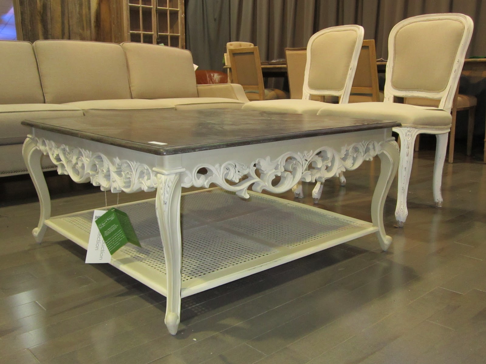
This unique table pictured below is one I was especially drawn to because of the mix of old and new styles. The modern table top is a gray stained wood while the base is clearly an antique design with curved legs and a caned bottom shelf.

From their 'Old Pine Wood Collection' series, I fell in love with this rustic piece (below) from van Dam International Trading Inc. When I eventually move to the country into my dream farm house my desire is to have an item of furniture like this to greet guests as they enter the mudroom.  The space will need to be large with high ceilings to accommodate this grand beauty!


Moving now from the country to a more sophisticated style of decor, these hanging pendants are truly elegant.  I'm thinking that they would add just the right amount of shimmer to any room.


More 'bling' for your buck....

M&L Art Furniture Makers Ltd.

This Cinderella carriage bed is magical.  I love the lanterns fixed to the sides and the sparkly buttons as accents on the head board.  Any little girl would have sweet dreams in this fairytale bed.


Dog lovers may go barking mad for this whimsical porcelain poodle lamp!

This Art deco chair with a glittery, classic image of Audrey Hepburn would be a well suited and glamourous addition for a chic, contemporary walk in closet.

I did think the upholstering could've been pulled tighter and finished with more care.


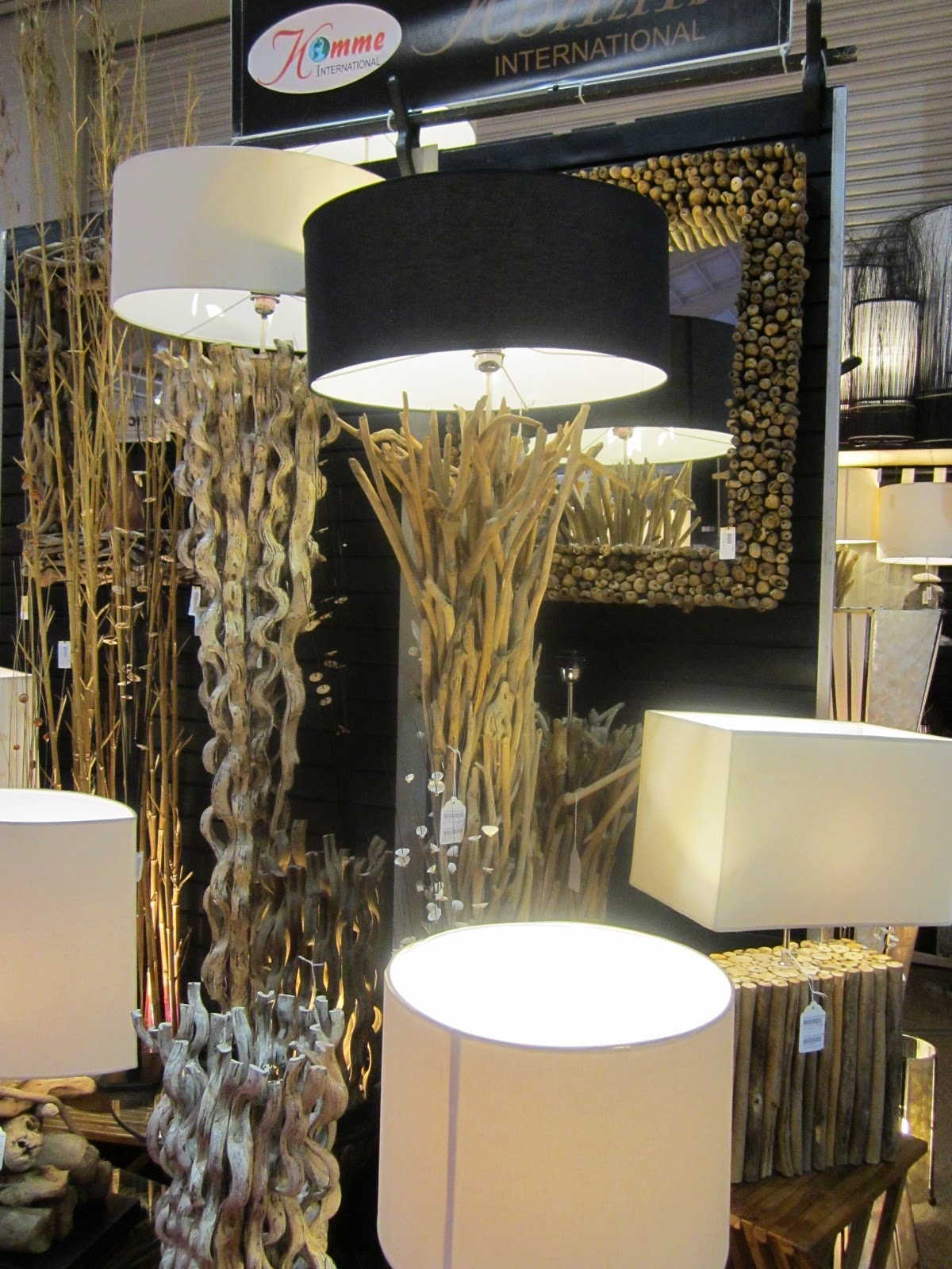
Nature inspired lamps with plenty of textural interest

Lastly, my post would not be complete if I didn't mention at least one item with British influence and flare!  Here is one of my favourites that I wish I had a room for in my house.

The Union Jack is dominant within Canada and is incorporated on the flags of Ontario, BC and Manitoba.

Europe often sets the scene for many trends, from designer fashions and colours to  home decor.  My friend and fellow blogger Lorrie Shirton wrote a post last year titled   'The British Invasion'. It's worth a read as it re-affirms British influences  are world wide and very much a part of what we Canadians love!

Tomorrow I am looking forward to attending the CGTA - Canadian Gift and Tableware Association.  It has more of the items you see in boutiques including fashion accessories like jewellery and handbags as well home decor items.  Upon my return I will share with you more photos of what I consider  to be 'delicious decor worthy'.  Stay tuned!