Showing posts with label fashion. Show all posts

Monday, 7 May 2012

The Ultimate Womens Show was the place to be!

What a weekend.  The Ultimate Women's Show in Hamilton was the first show that I have participated in as an Exhibitor and boy was it fun!  Hard work and tiring, but fun.
 
My booth was just a 5' x 10' space, so I had to work my design magic to ensure it got noticed without being too crowded. My show piece was my antique buffet which was very functional as not only was it great for displaying accessories, but the extra storage also came in handy.

Some of my pictures turned out blurry, sorry about that.  But you get the idea.
Many people commented on how much they loved the updated antique piece and especially the colour and new hardware.  'Violet' is what I named my mannequin, she was dressed in fabrics from Avant Garde, Maxwell and Joanne Fabrics. 

My florals were done by my good friend and fellow Interior Decorator Maria who did a fabulous job of incorporating all the colours in my display.  Thanks for all your help over the weekend Maria, you are the best!

I decided to use purples, greens and yellows and 'pop' with the colour of the year, Tangerine Tango.

I was right in the middle of the action having a corner booth by the main stage.  The fashion show was fantastic, showcasing clothing and accessories from local shops. Here are some of my favourites:


These ladies above are modelling clothing from 'Jus B' Gauze' in Burlington.


These colourfully wild boots are from 'Zeyzani's One of a Kind Selection


I made some new friends along the way as well...


We always watch CHCH Morning Live so I was so excited to have Lesley Stewart in my booth!

What hard work this show was having my booth across from the firefighters. Hey Adam!
Louis from Hotti Biscotti said he'd love to join me as an Interior Decorator, but he and his Mom are doing just fine with their yummy biscotti business.

My fab friend Maria and I posing for a photo in my Creating Contrast Designs booth.  Cheers again babe!
Thanks to all my friends and clients who came out to see and support me at the show.  And thanks to those who stopped by to enquire about my services and completed a ballot to win a 2 hour Interior Decorating Consultation.  I will be doing the draw later this week and will be in touch with the lucky winner soon.  Good luck!

If you would like to find out more about the services I provide, contact me and I can help you create a beautiful space that you are happy to come to, share with your family and entertain in with friends. 

Wednesday, 28 March 2012

A Sneak Peek at what's to come in colour and fashion...

'Colour Stories' is an exciting new series of paint colours from Benjamin Moore.   Last night I attended a Designer Gala with guest speaker Leigh-Ann Allaire Perrault of Benjamin Moore and City Line where she proudly introduced this new line of 240 full spectrum colours.


Colour Stories Fan Deck

These colours have more depth and intensity than other colours because of the unique make up of the paint that also allows the colour to change with the light and is almost impossible to duplicate.

From the 'Earth & Sky' Eco Trend Palette of BM Colour Stories
These colours are unique as there is no black or gray added and they are made up of 5-7 pigments instead of the usual 2-3 pigments used in most paints.  I will be dedicating a post to the 'Colour Stories' shortly and reveal some of the stunning palettes that I was privy to last night, stay tuned!!!

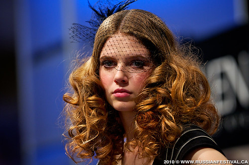
On another note, this weekend I will be working the ABA show in Toronto.  I've worked this show every year for the past 7 years & I'm always eager to see what wild and gorgeous hair and make up fashions are adorned on each stage.  Exhibitors include Loreal; Redken; Matrix, Wella and more.

Source
It is no secret that what we see in fashion eventually resonates and is filtered down to our home decor. For this reason you can bet I will be keeping my eye on what colours are hot, styles of hair design,  accessories adorned by the models and of course, the fashion.  And as always, I will be blogging about these latest trends upon my return.  Enjoy the rest of your week!
 
The work that goes into these creations is amazing

Thursday, 10 November 2011

Colour Schemes

One of the first classes I took for my Interior Decorating Certificate was Colour Theory.  It was an amazing course.  My teacher was so knowledgeable and passionate about colour that it gave me goosebumps!  We did plenty of colour mixing and it made me realise how tricky colour can be.  By adding a tint of white  or a shade of black a colour can be changed dramatically. 


It is for that reason that I wanted to go over some of the different colour schemes used not only for Interior Design, but also in Marketing, Fashion, Advertising and  Web Design.  I will not patronise you with the definitions of 'primary'; 'secondary'; and 'tertiary' colours, but if you would like a refresher click here for a diagram of a colour wheel.

Monochromatic refers to using any tint, tone or shade of one colour. When you tint a colour, you are adding white to it and therefore making it lighter. Grey is mixed with a colour to give the 'tone' and to shade a colour, we add black.  Remember, by adding white, grey or black to a hue makes the colour less intense.

Monochromatic Reds


  The visual effect of a monochromatic colour scheme is harmonious, generally quiet and restful.

Monochromatic rooms are not boring if done correctly.  Some neutrals are required to bring it all together.

An Analogous harmony combines several colours that sit next to one another on the colour wheel.  It must contain at least one of the 'primary' colours, but the hues can vary in value (Value refers to the lightness or darkness of a hue & all colours have what is known as high value or low value)


This colour harmony is a non-contrasting colour scheme which is soft and invites easy living.

The combination of blue, blue-green and green hues are soothing, yet fun in this bedroom. There is also a splash of blue-violet in the picture next to the bed which still carries into the Analogous colour scheme.

Complementary colour schemes joins colours that are opposite each other on the colour wheel.  The most obvious complementary harmonies are: red & green; blue & orange; purple & yellow.

Source


The complementary colour scheme can be expanded to include shades and tints.  When complementary colours are viewed next to one another, they will intensify each other. This can make for rooms that are exciting and stimulating.


Different tones can be used of each colour.
Although there are other colour harmonies, I have only touched on a few of the most popular schemes used in decorating.  It is important to consider what colour combinations you are using to provide  visual unity that may not be as obvious with patterns and shapes. 

While grays are very popular now they only work well in the company of other colours.  So, enjoy decorating your own space and be sure have fun with colour!

By the way, I am very excited to be heading to the Junior League Holiday House Tours tomorrow. If you have never been, I highly recommend visiting these beautifully festive decorated homes, it is both inspirational and fun.  You can buy tickets at the door if you haven't pre-purchased them already.  Click on the link above to find out more. Of course I will be doing a post on the tours, so if you miss this event be sure to check in with ~delicious decor~ for all the details!

Friday, 21 October 2011

How to choose colours for your home?

You don't have to look much further than your own closet to know what colours you should be using to decorate your home.  One of the first things I take note of when meeting a potential client is what they are wearing.  Clothing offers many clues to our colour and style preferences.  It is a great way for us to express our personality and individuality in the same way that we should be doing with our homes' delicious decor.

A bold triadic colour scheme suggests a strong & fun personality
Bright, but well put together


People who enjoy upcycling and frequenting thrift shops will undoubtedly have different preferences for home decorating compared to those who wear only brand names and are on top of the latest fashion trends. I am not saying that one is a better style than the other, as long as it's all put together with consideration for scale and balance, either can look fantastic. 

Warmth is added through textiles & natural elements
A contemporary chic condo (above)is warmed up through rich textiles and other natural elements of design.  Leather, fur and plants are a terrific  way to make a space feel more cosy, especially if you want to add some warmth to contemporary styles that tend to look stark and cold.  If you prefer something more exotic, incorporate zebra stripes or other bold patterns into your scheme.

Complimentary colours, purple and yellow


At the moment, we are renovating our basement and I have decided that I need to incorporate plums! I love deep purples and feel confident when wearing them.   The basement is painted a golden yellow colour by Benjamin Moore called Wilmington Tan and it has totally softened up the room.  As purple and yellow are complimentary colours they will work beautifully together and also look very rich with my espresso furniture.  Once it's completed I will post the pics!

Surround your home in colours you love and that make you feel good about yourself.  Look at your wardrobe the next time a decorating project is upon you and get inspiration from what you wear.  If you feel you are longing for a colour (I was dying for blue recently) then see where you can add a few accents with this colour and it will make you feel happy!

Still not sure about which direction to go?  Contact me and I will help you create a space that you are happy to come home to, share with your family and entertain with friends.  View my website at http://www.creatingcontrastdesigns.com/ for further information on the services I provide.