
Undertones, cool vs warm and sun exposure are all factors that need to be taken into consideration when choosing colours. I want to peel back yet another layer of the complex world of colour by explaining and helping you to identify the differences between 'clean' and 'dirty' colours. This was a large part of our discussions during my True Colour Expert course & is very relevant in home decor.
 |
| Compare, compare and compare again! |
 |
| Currently I am craving a more muted or 'dirty' blue hue similar #89 'Lulworth Blue' or #237 'Cook's Blue' |
The blue that I have been yearning for lately may be completely different to what someone else is thinking is their favourite shade of blue. The only way to know for sure is to compare. Looking at the Farrow and Ball shades of blue (above) you can see how some blues are more of a greeny blue and others are more purple - all because of their undertone.
 |
| This blue wall colour is nice, but much more 'fresh' that what I am looking for just now. |
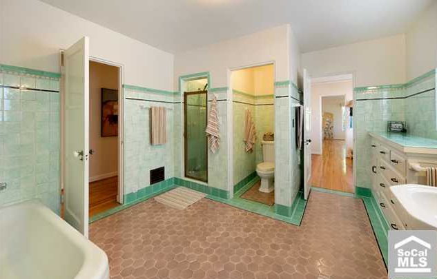 |
| Imagine how much nicer this room would look if the flooring was a crisp, clean white tile |
This picture from Maria Killam is one of the best examples of the clean & dirty comparison. The green wall tiles make the honey comb patterned flooring look as though it hasn't been cleaned in quite some time. Or you could say that the green tile is a clean colour and the flooring is a dirty colour.
Here are other examples of where clean and dirty tones have been mixed in home decor.

In the above photograph, no one can dispute that the curtains and the amimal-esque statues either side of the large cabinet are yellow. However, the accessories are a bright (clean) yellow in comparison to the curtains which when placed next to these bright items, appear 'dirty'.
The living room (below) has a soothing greeny blue colour on the accent wall with creamy shabby chic styled furnishings. While the turquoise painted legs on the tufted bench are bright (clean) in comparison to the soft muted (dirty) tones of the wall and the buffet.

Although this bright turquoise does a nice job of co-ordinating with some of the glass accessories, it is much cleaner that the rest of the calming tones used in this room.
Bear in mind that when looking at clean and dirty comparisons, you can almost always find a colour that is more dirty or more clean than another. See below for a final comparison:
The colour Corn Silk (below) is cleaner than Golden Straw.
However, Golden Straw (below) is the cleaner colour when compared to Powell Buff.


And I'm sure we could find colours dirtier than Powell Buff and cleaner that Corn Silk and so on and so forth. Take a look around your ~delicious decor~ to see if you've mixed any clean and dirty colours.
I won't lie to you, in my kitchen I have a dirty back splash and clean cookie jars. Thankfully the jars are minor accessories that I can easily change rather than a fixed element that would drive me crazy now that I have trained my eye what to look for.
If this is as clear as mud to you, don't panic! Contact me, a Certified True Colour Expert. I can help you choose the best clean or dirty colours for paint, back splash, flooring and furnishings to make you fall in love with your home again.
No comments:
Post a Comment