
Over the holidays there was no rest for Creating Contrast Designs, we were busy renovating a dental office which involved a lot of work in a short amount of time. It was very labour intense to say the least, but with my professional, reliable and hard working trades, the job went off without any complications. Here are some pictures that show the remarkable transformation.
BEFORE:


Removing the wallpaper and changing out the carpet were high on my list of recommendations. Those of you familiar with my blog will remember my 'Bully in the Room' post which would definitely of been the case if I had to work with the previously existing carpeting or wallpaper.
DURING:


My client, Dr. Grant Yiu wanted to brighten up the space & give the office a fresh new look. I agreed and suggested we start in the main reception area rather than the operatories which was the original idea. This way current patients can appreciate the updated office and there is also an opportunity to attract new clients looking for a more modern dental practice with friendly & caring staff. - I can say that with confidence as Guelph Line Dental has been my dentist for more than 15 years!
AFTER:
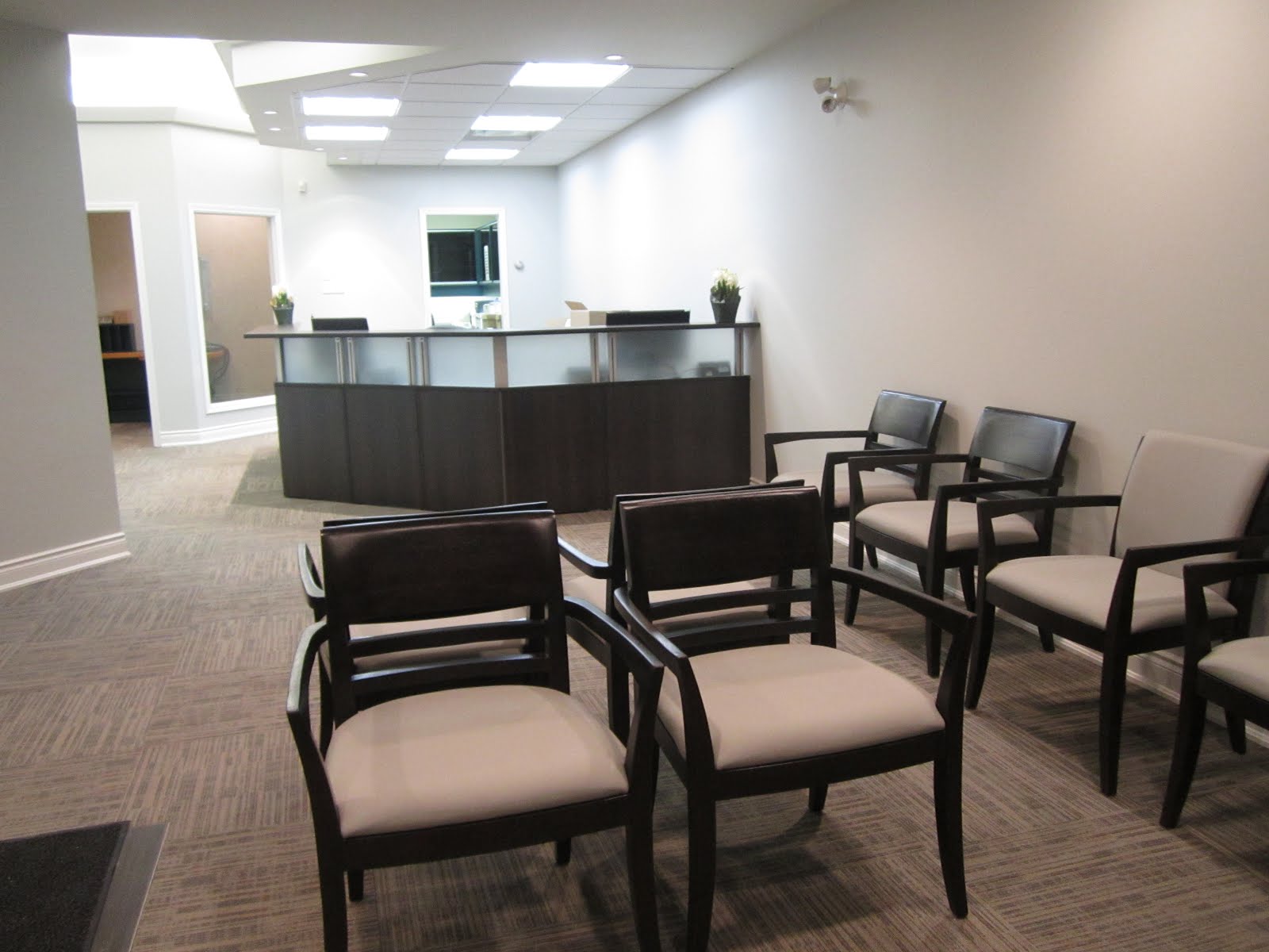 |
| The bulkhead above the reception was dramatically reduced to open up the space. |
Currently we are working on the design for a feature wall behind the reception area as well as choosing finishes for the main washroom. Details such as wall art, coffee tables & drinks area have yet to be implemented, but the bulk of the work is done and the office is open once again for business. My client and his staff are so very happy with the changes, which means I am too!!
 |
| Future drinks area with possibility of a TV above. |
 |
| Left side partition walls painted a more 'blue gray'. |
So how did I come up with this beautifully fresh modern design and manage to keep a warmth to the overall feel? My inspiration for the design initially stemmed from the tranquil new logo for the Burlington based dental office and I obviously wanted to tie this into the new colour scheme.
The first item I sourced was the carpeting. I was on the search for a slight pattern that incorporated both the blues and grays my client was looking for, but I wanted to be careful that the palette wasn't made up of completely cool colours. The overall design I wanted to achieve was for both a modern and soothing feel. After all, it is a dentist office and for some people visiting the dentist is a daunting experience, so maintaining a relaxing setting was key.
 |
| The carpet are 2x2 tiles that we 'quarter turned' to alternate each one. |
There are a couple of benefits to using these types of carpet tiles. Not only can you choose how you wish to lay them out to give you different looks, but they are also easy to replace should a piece get stained or damaged in one way or another.
Once the carpet was decided upon everything else nicely fell into place. The carpet tile has a shade of a neutral brown which allowed me to use warm finishes for the chairs, reception desk and drinks console. The vinyl on the chairs are easily wipe-able and nearly the same colour as the main walls - OC52, Gray Owl by Benjamin Moore.
 |
| Dark and dated. |
 |
| Painting out all the oak trim and ceiling in white gives such a lighter feel. |
All the ceiling tiles and light fixtures were also replaced to brighten up the space. The office is now much more open and welcoming. If you or anyone you know are considering a new dentist in the Burlington area, I know of a place that is just perfect!
Check out the website of Guelph Line Dental to learn more about this friendly practice with a fresh new look.

Looking back at the 'before' pictures reminds me of the title of a classic album by Fat Boy Slim...
"You've come a long way baby". Ain't that the truth!
To be sure you don't miss any of my marvellous makeovers and for 'must have' decorating advice, become a ~delicious decor~ subscriber. Enter your e-mail details below & you'll never miss a post!
If you have a space that you would like to transform, I can help. Contact me for a free half hour consultation where we can discuss the dreams you have for your space and how hiring my services will benefit your project. Call me at 905-599-2588 or go to my website, enter your details and I will be happy to contact you.
That looks fabulous, Claire! Very open, clean and bright, I love it ! :) -Ange
ReplyDeleteGreat job Claire, soft and soothing...
ReplyDeleteThanks Ladies!
ReplyDeleteLooks so much nicer and inviting! What a relief that they got rid of that carpet and green wall colour and that they took your advice about painting the white trim. All your hard work makes a huge difference! So fresh and updated! - Jennifer
ReplyDeleteYou are right in brightening up your office space and make it more open and welcoming to the customers. The slight pattern carpet, ceiling tiles , light fixtures and more added a warmer environment to the guests.
ReplyDelete